Creating an accessible design system for an iconic Australian brand.
BCF
Introduction
In January 2021, I was approached by BCF to craft a new design system. Their goal was to improve online conversion on their website through a cleaner and more accessible representation of their brand that would scale well across all online mediums. Additionally, they wanted to speed up design and delivery workflows, by having a ready-made set of accessible components and content templates that their teams could use to quickly bring ideas and campaigns to market.
As the only designer on the project, I created the new design system end-to-end and worked with internal development teams to ensure it was implemented with integrity.
The new design system was launched on the BCF website in July 2021.
My role
Design system
Digital accessibility
Visual design
Content strategy
Understanding the pain points
To begin with, I organised a workshop with all the business units that would be using the new design system, in order to understand their pain points that would then translate into requirements for the final solution.
Key pain points
1. The styleguide was outdated and lacked brand guidelines.
2. Assets were decentralised and hard to find.
3. It was time-consuming to design features and campaigns, due to a lack of predefined components and templates.
4. There were no guidelines on digital accessibility.
5. All of the above resulted in a clunky and inconsistent brand experience.
Initial accessibility improvements
One of the main business goals for the project was ensuring that the brand adheres to accessibility standards. Because of this, I started off by running a detailed accessibility audit of the website and actioned a series of improvements.
Accessibility improvement #1
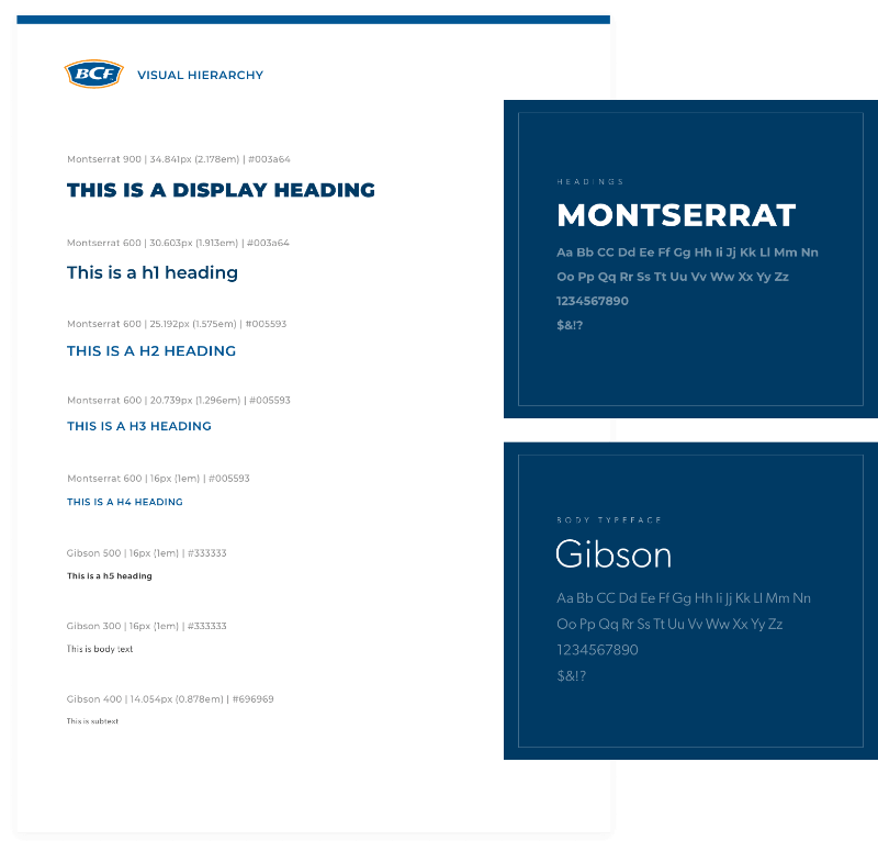
Redefine typography guidelines
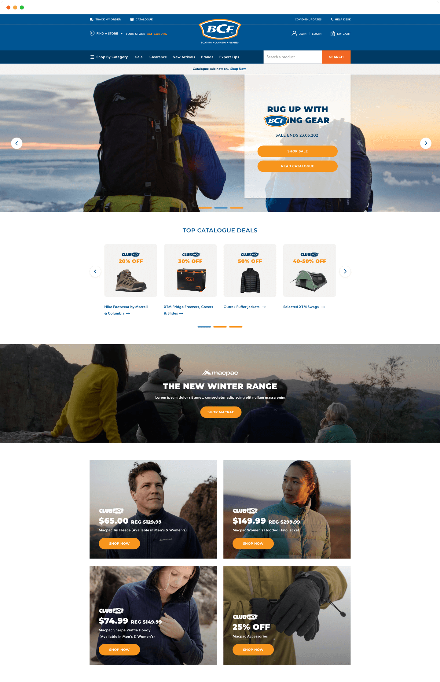
The previous brand typeface was difficult to read and did not scale well across devices. Although we retained Montserrat for headings, we decided to change the body typeface to Gibson, as it has great legibility even in smaller sizes due to a good x-height and low-contrast strokes. It also has a slightly playful edge which is a good reflection of the BCF brand.
Additionally, to meet accessibility standards I increased the base font size to 16px and updated heading sizes to establish a clearer hierarchy based on a modular scale ratio.
Accessibility improvement #2
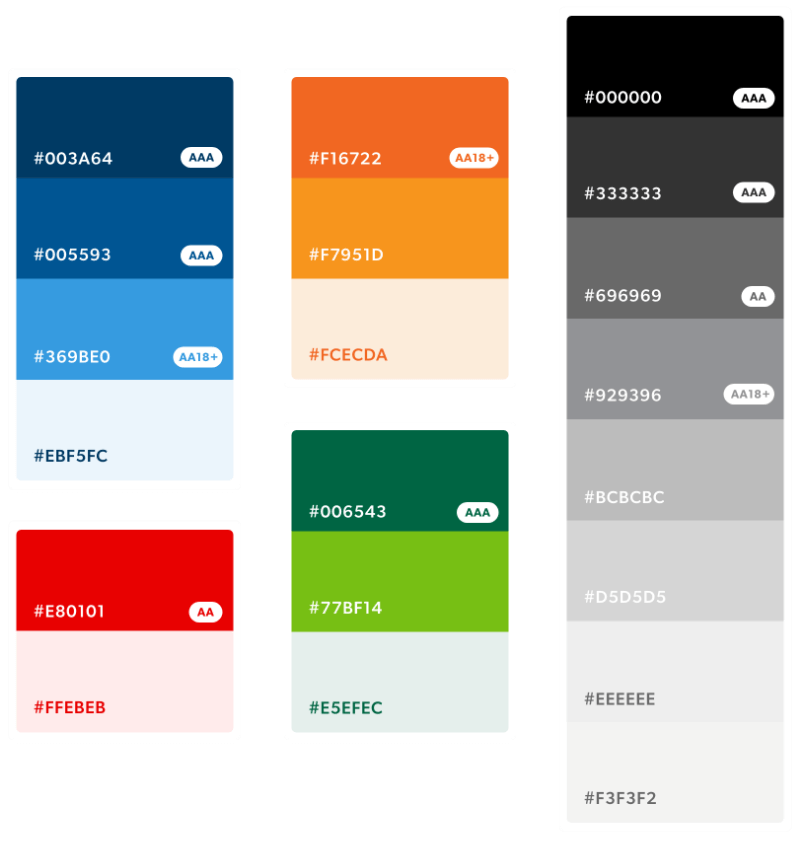
Increase colour palette contrast
The web colours that were being used on the website did not meet colour contrast guidelines. In order to adhere to AA standards, I tweaked the palette (with approval from the brand teams) to ensure that all accent and secondary colours pass contrast.
We ran some quick A/B tests using VWO on the website to test the new colours. Indeed, the higher contrast for accent colours drew more attention to key elements and CTAs, which led to a clear increase in conversion!
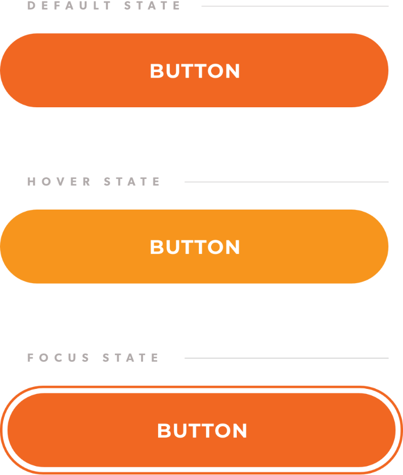
Accessibility improvement #3
Implement hover and focus states
At the time, the BCF website was lacking in clear hover and focus states, which was not only a problem for screen readers or power users navigating with their keyboard, but also everyday users interacting with site elements.
In the new design system, we considered hover and focus states for each component to make the website accessible.
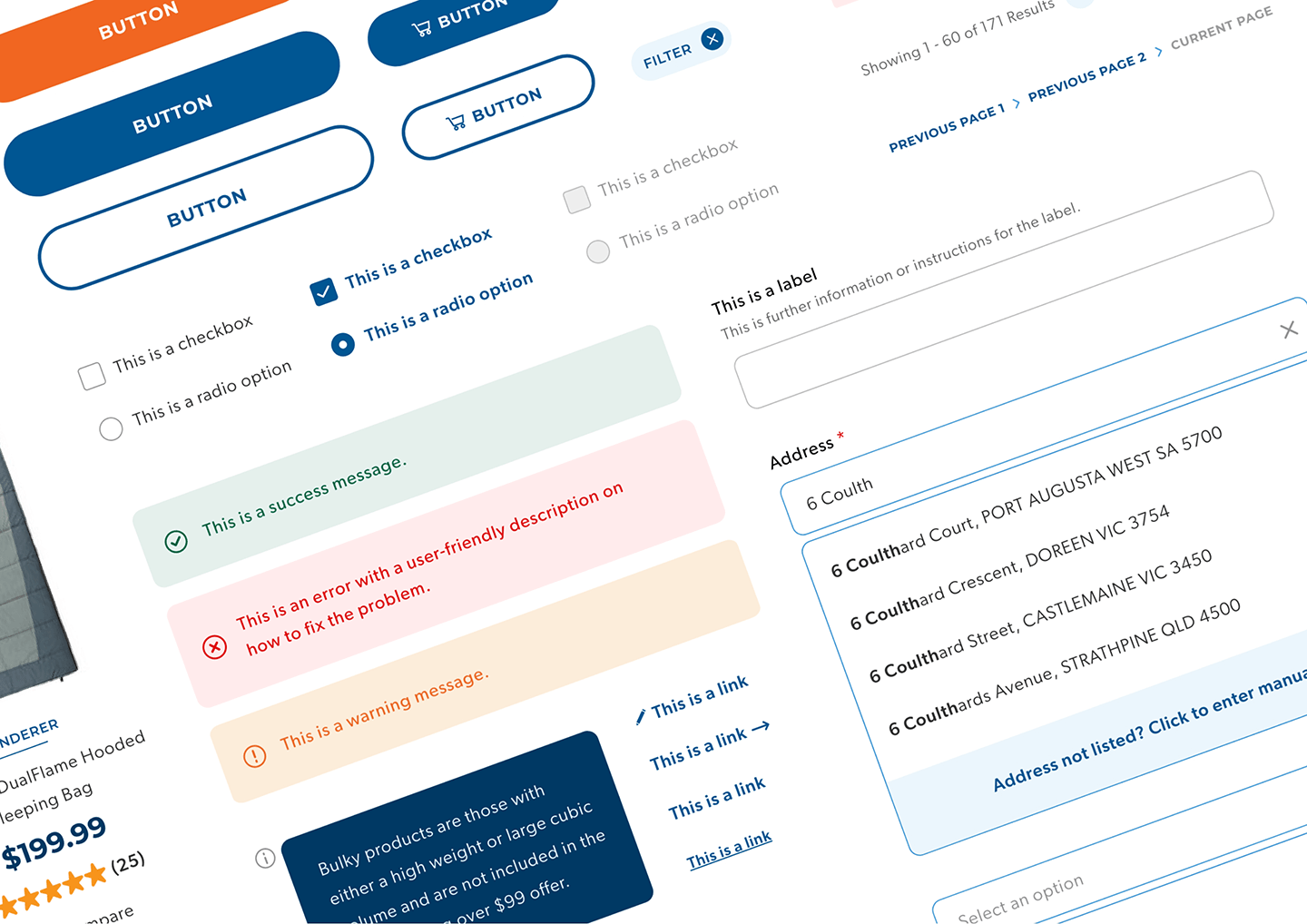
Other accessibility improvements
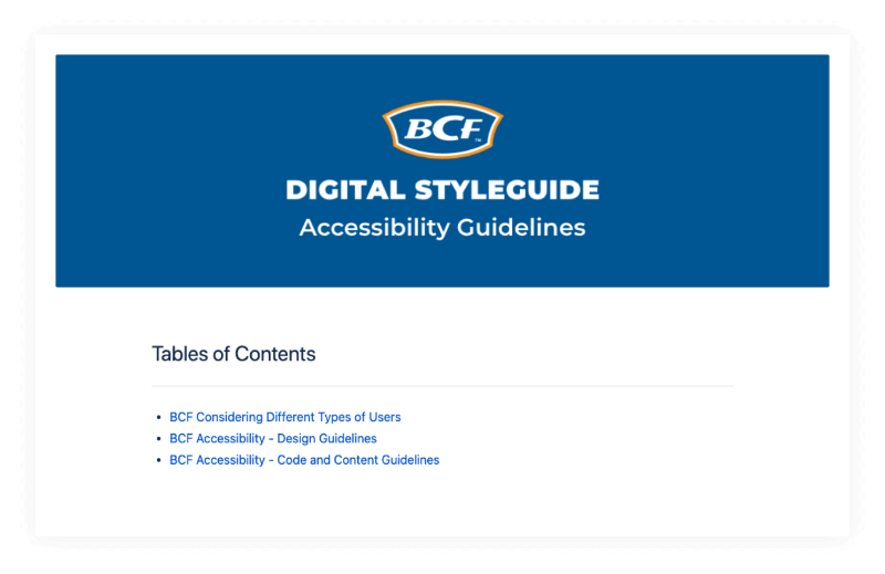
I also identified other key accessibility improvements covering the implementation of alternative text, title tags and form elements. Aside from educating the teams on best practices, I wrote detailed accessibility guidelines (documented in a central styleguide) for the team to reference and have easy access to.
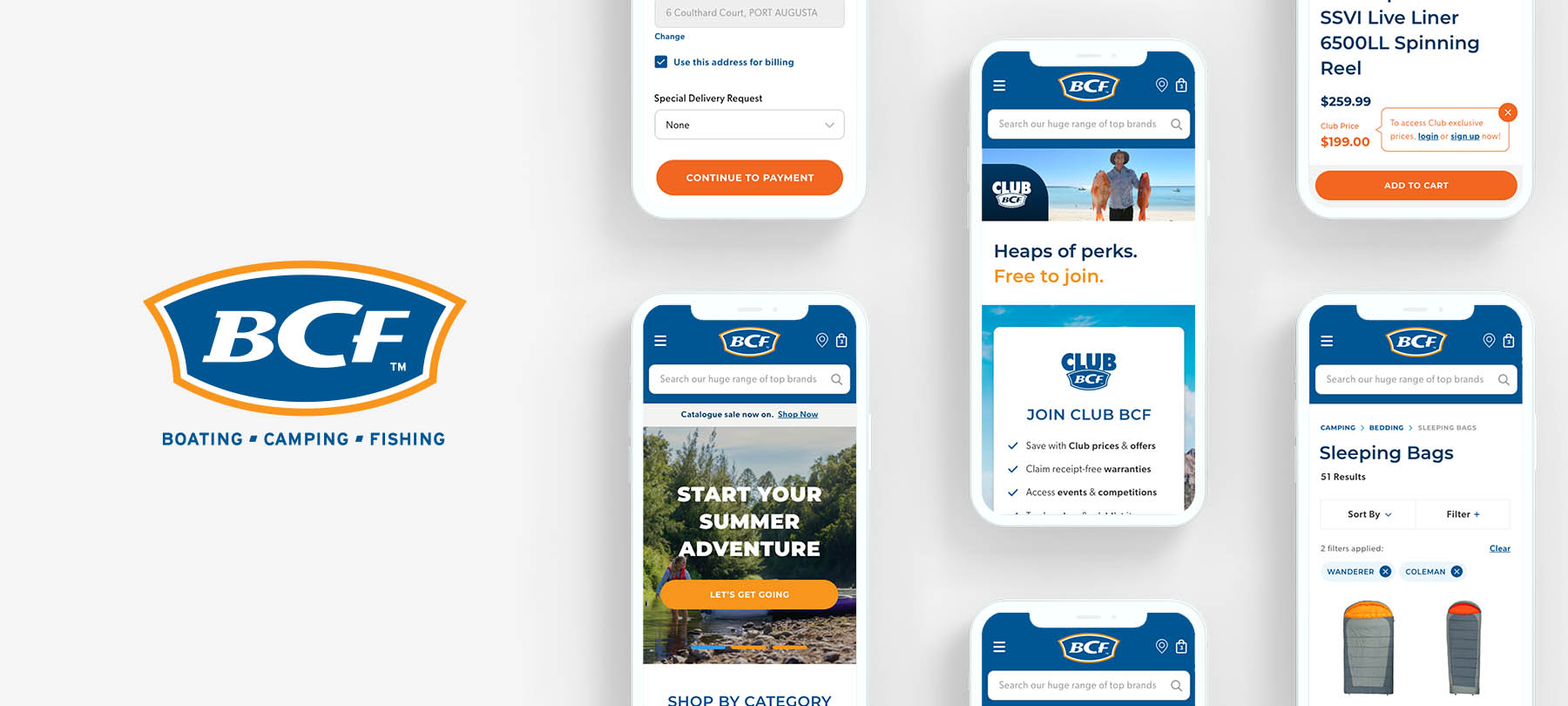
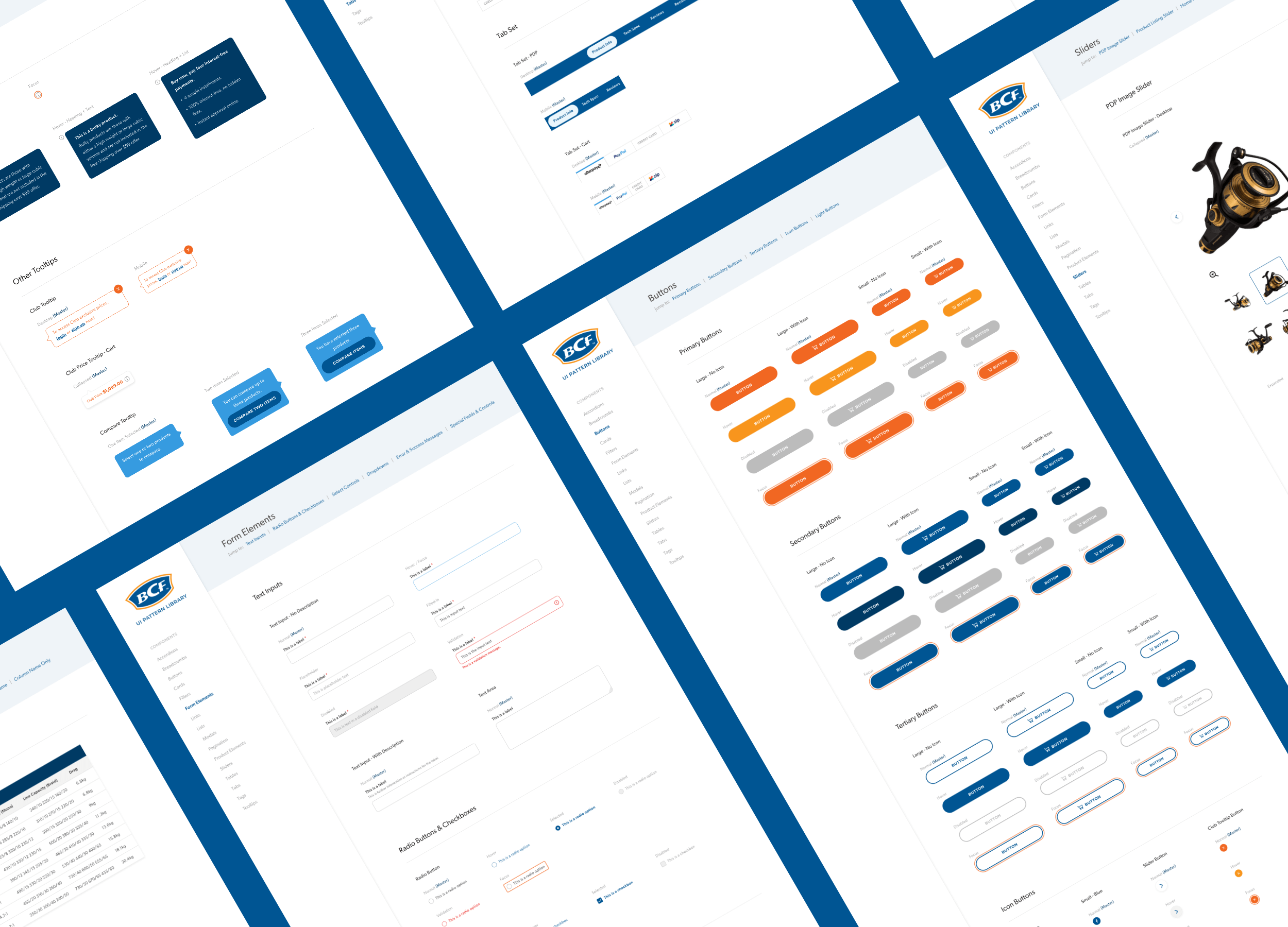
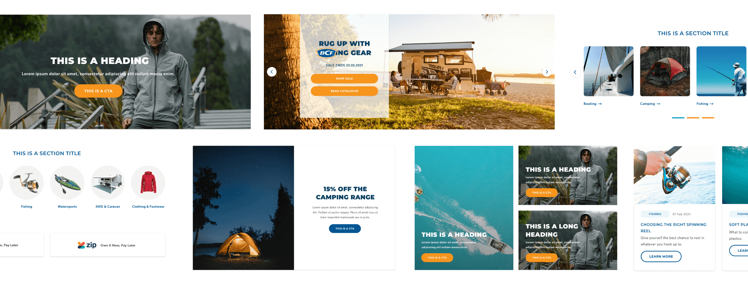
Creating the UI pattern library
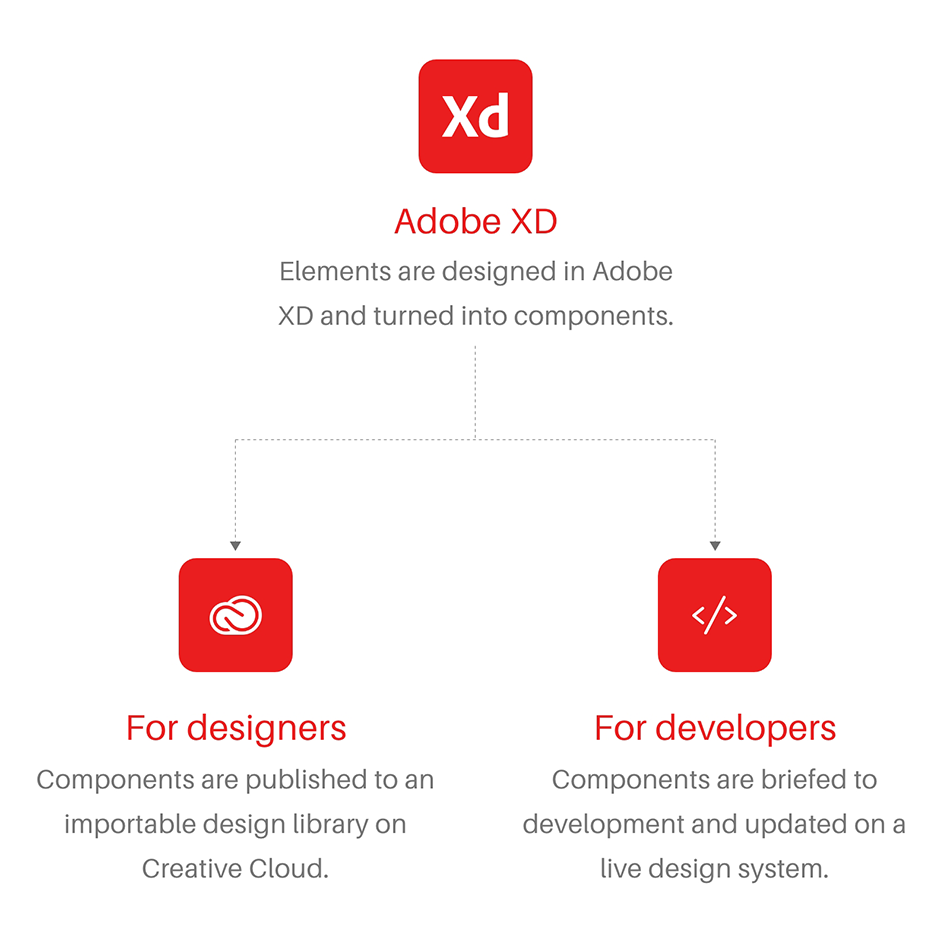
Once all the brand changes such as the updated typography and colours were approved, I used Adobe XD to design from scratch all the individual components that would make up the new BCF site.
The cloud-based file was published as a Creative Cloud library, so that the whole BCF team could import components into their files and quickly create mockups. Additionally, I worked with development teams to create a live design system where these components would be readily available to developers as well.
A new set of content templates
In addition to having access to individual UI patterns, the BCF team wanted a library of content templates that they could use to build marketing campaigns on the site. Before diving into the design, we created user flows mapping the ideal website journey for different types of promotions and then defined the content templates that could be built to support that journey. Once it was approved by marketing, I then translated our ideas into content template designs for desktop, tablet and mobile.
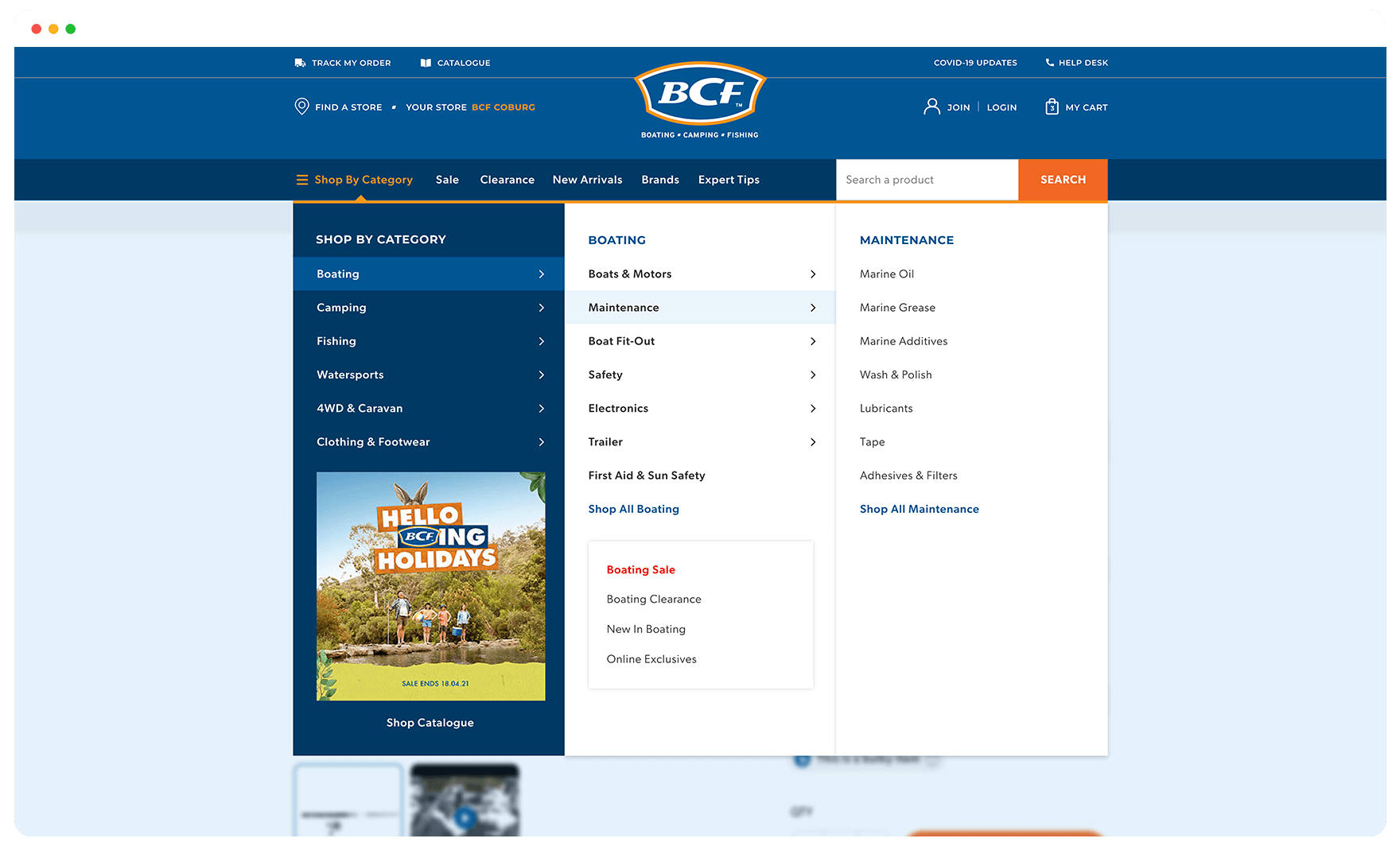
Redefining and testing the navigation
Alongside building the design system, BCF also wanted to improve the user experience of key aspects of the site. One example of this was making the navigation UI more intuitive. I mocked up different navigation concepts which were thoroughly A/B tested - below were the winning versions for desktop and mobile.
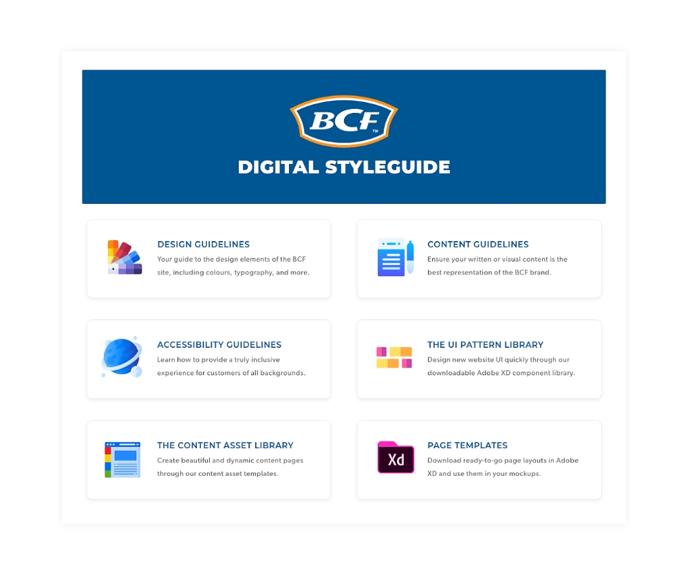
Centralising all guidelines in a digital styleguide
To end the project, I centralised all of the information in a central styleguide that the whole team would be able to access. Confluence was chosen as the medium to host brand guidelines, so that anyone would be able to update the pages as required.
In collaboration with the BCF team, I wrote detailed guidance around design and accessibility patterns, as well as content guidelines (including microcopy, grammar & mechanics). I also created pages around using the UI pattern and content template libraries, including best practices and instructions on using and updating components.
The final result
After working very closely with developers and quality analysts, the updated brand and accessible design system were launched on the BCF website. The improvements we made resulted in a clear increase in conversion and it gave BCF teams the flexibility to quickly design new features and campaigns using the pre-made components and templates. Additionally, we assigned champions within the business who would be responsible for updating the styleguide and design system in the future, and who would ensure any new designs and campaigns followed the defined guidelines with integrity.
Other Projects
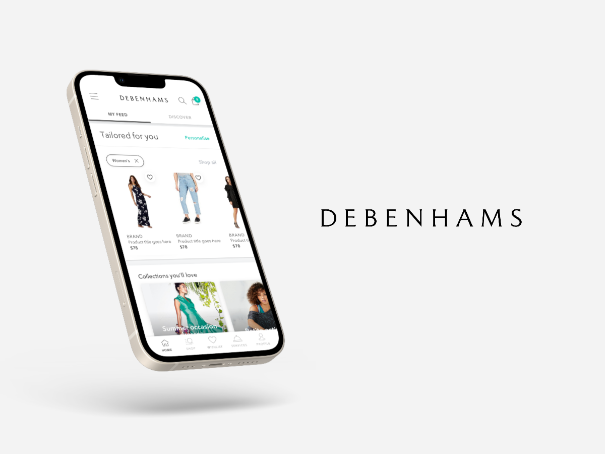
Debenhams Australia AppUser Research, Product Strategy, Experience Design
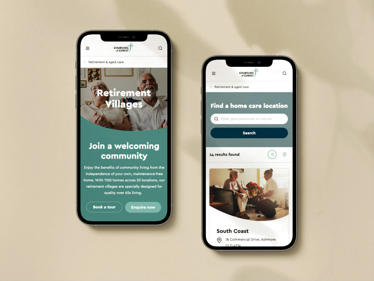
Churches of Christ WebsiteUser Research, Experience Design
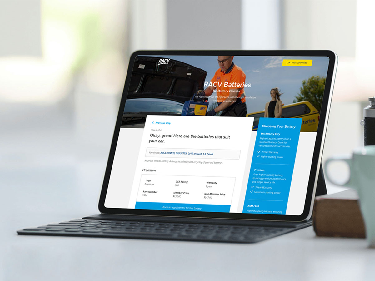
RACV Battery Booking SystemExperience Design, Visual Design
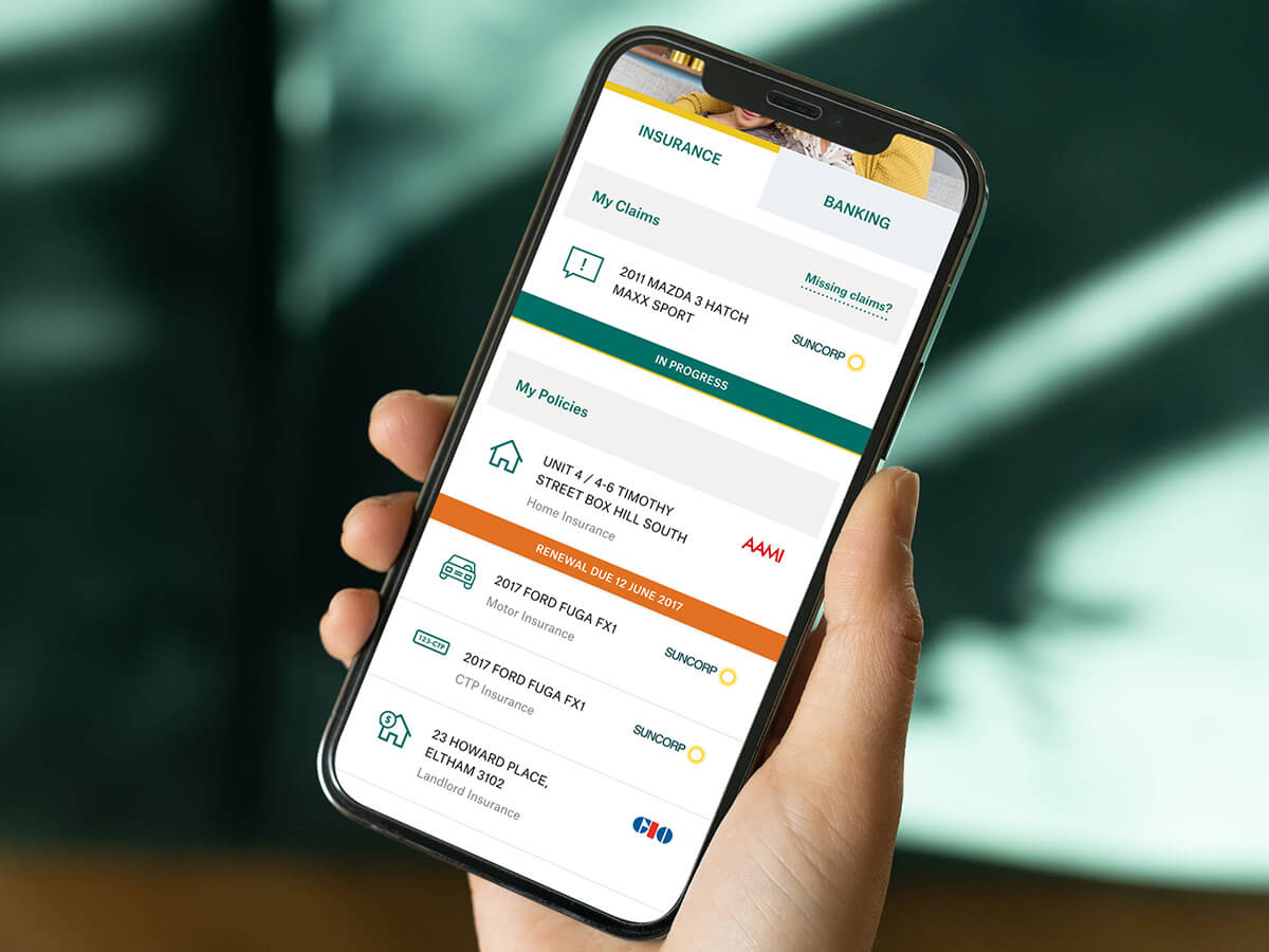
My SuncorpExperience Design, Visual Design
The Learning SpaceUser Research, Product Strategy, Experience Design
Interested in working together?
Let's grab a coffee (in person or via Zoom).
© Florencia Mostaccio 2022 - ABN 82 342 102 322
Based in Melbourne, Australia.